
BRAND JOURNEY · 2018 — TODAY
Three letters,
drawn four times
It’s been nine years since we opened our first factory in 2017. Before our tenth year begins, we’re looking back at how far we’ve come.
The three consonants of 바른샤시 (BARUNSASH) — ㅂ, ㄹ, and ㅅ — have changed shape since our first logo in 2018, but they have always been at the heart of the brand.
Here are all four rounds of brand work, led by Misun Sim, Founder & CEO.
012018
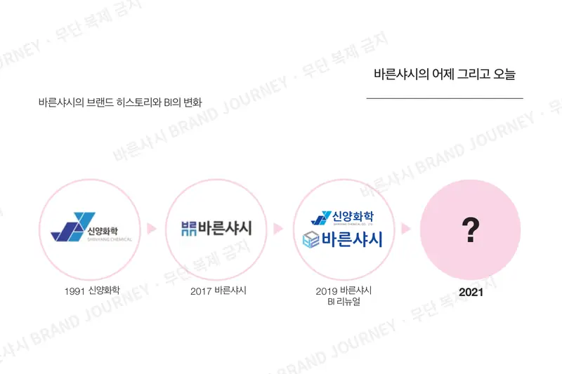
The first window we drew
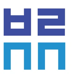
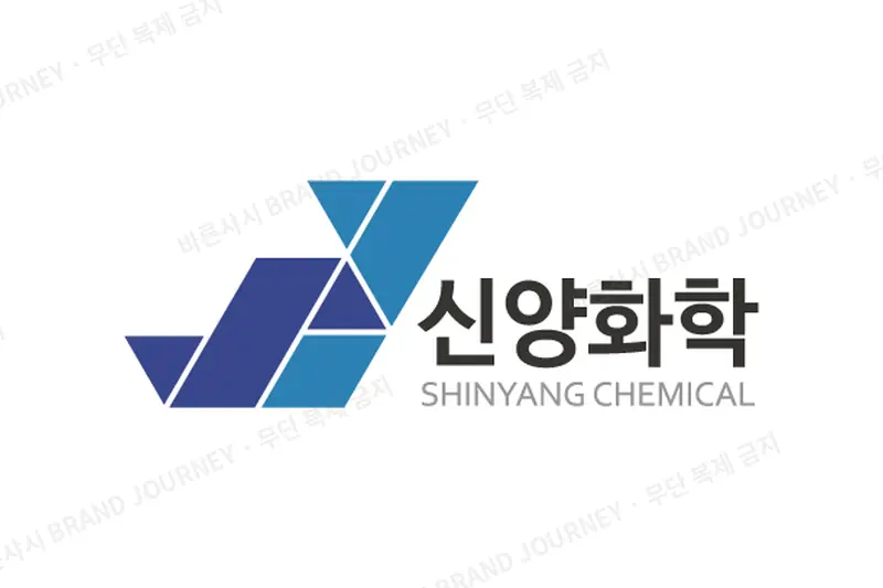
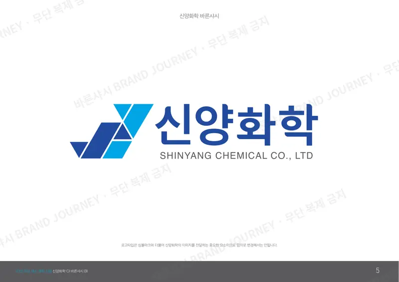
First Shinyang Chemical corporate logo · First BARUNSASH brand logo
The year BARUNSASH first went out into the world under its own name, we created Shinyang Chemical’s first corporate logo and BARUNSASH’s first brand logo.
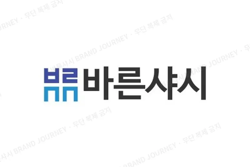
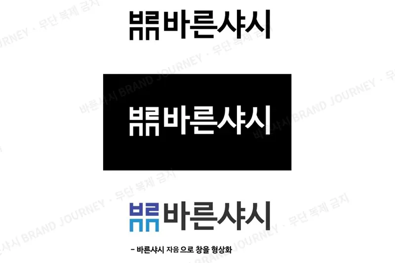
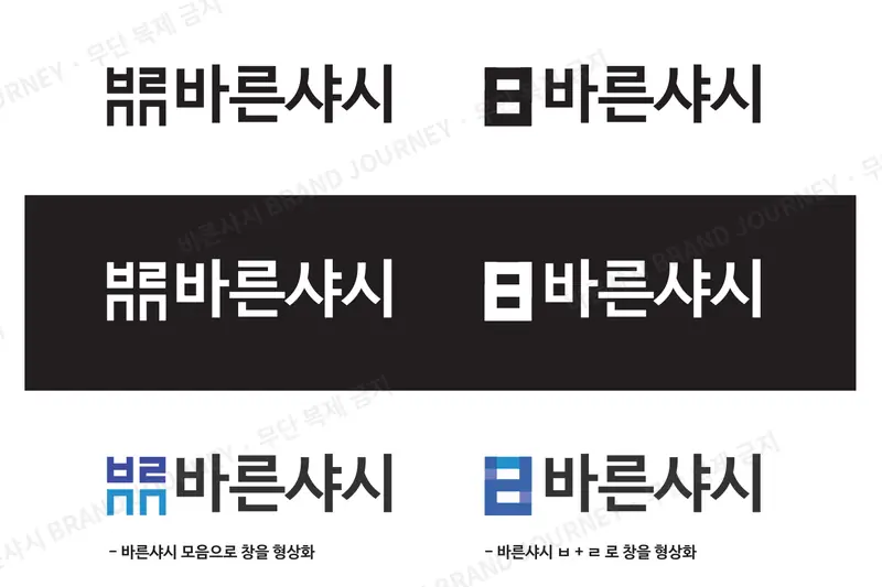
We arranged the consonants of 바른샤시 — ㅂ·ㄹ·ㅅ·ㅅ — like the four panes of a window, so the name itself became a window.
This idea of “drawing a window with consonants” carried through to every logo that followed.
- BARUNSASH brand logo
- A window shaped from the consonants of 바른샤시. We also drew a draft with a window made by combining ㅂ and ㄹ.
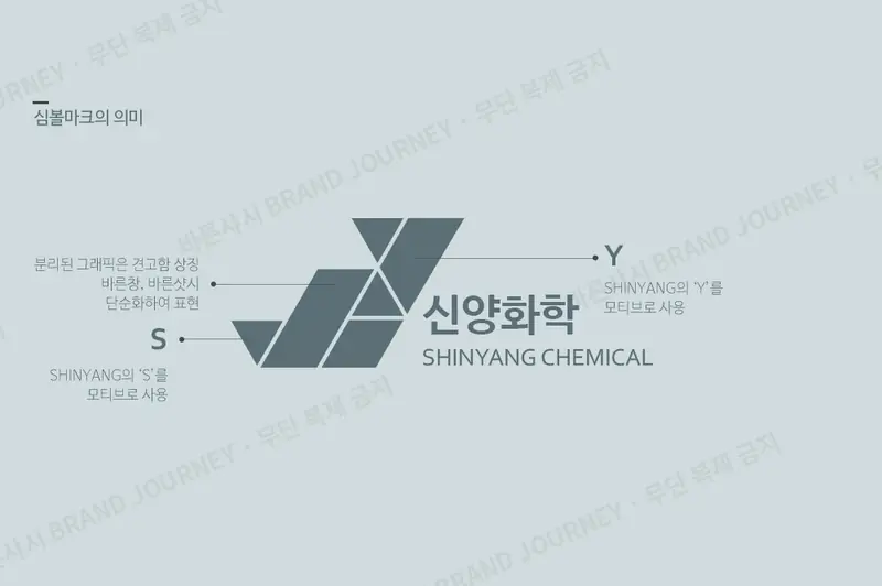
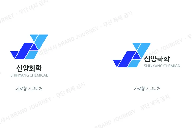
- Shinyang Chemical corporate logo
- Inspired by the S and Y of SHINYANG. The separated shapes stand for strength and give a simplified take on “windows made right” and BARUNSASH.
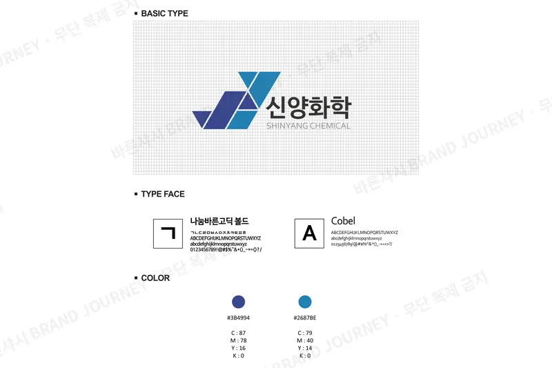
- Typefaces
- Nanum Barun Gothic Bold · Cobel
ConsonantsWindowStrength
Planning & design: Chicago Comms Co., Ltd.
022019
One matching look
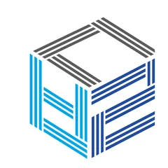
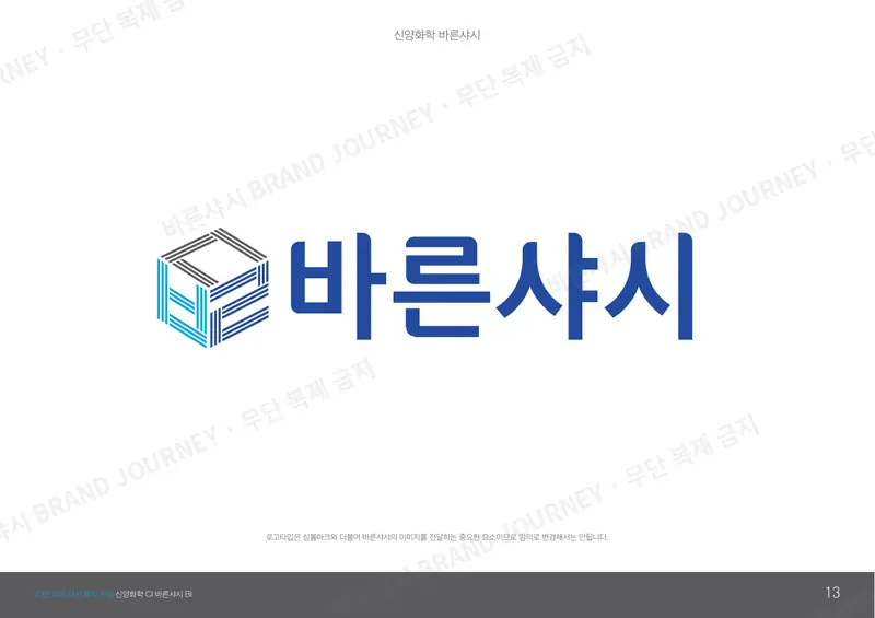
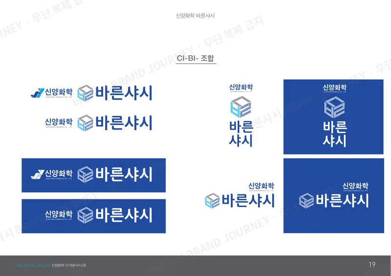
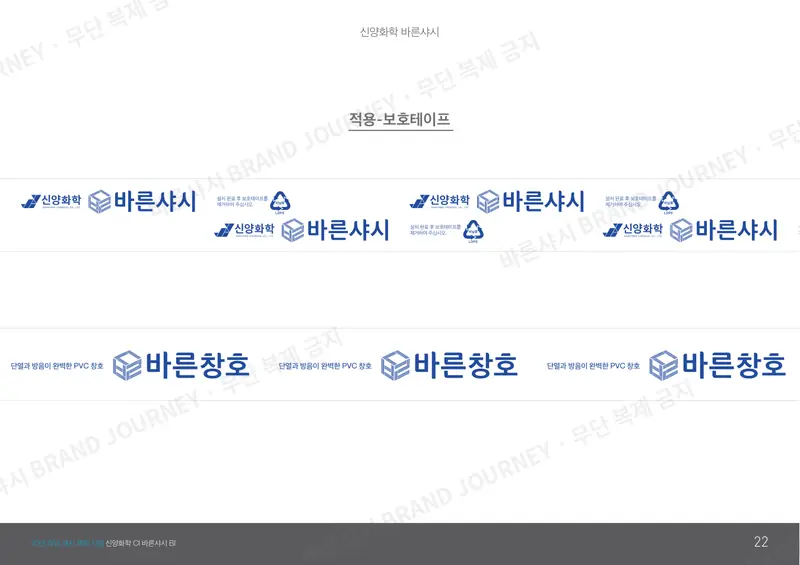
Shinyang Chemical corporate logo · BARUNSASH brand logo redesign
Just one year later, we drew it again. Shinyang Chemical has made window systems for more than 30 years, and BARUNSASH was born from that know-how.
This redesign gave both names one matching look.
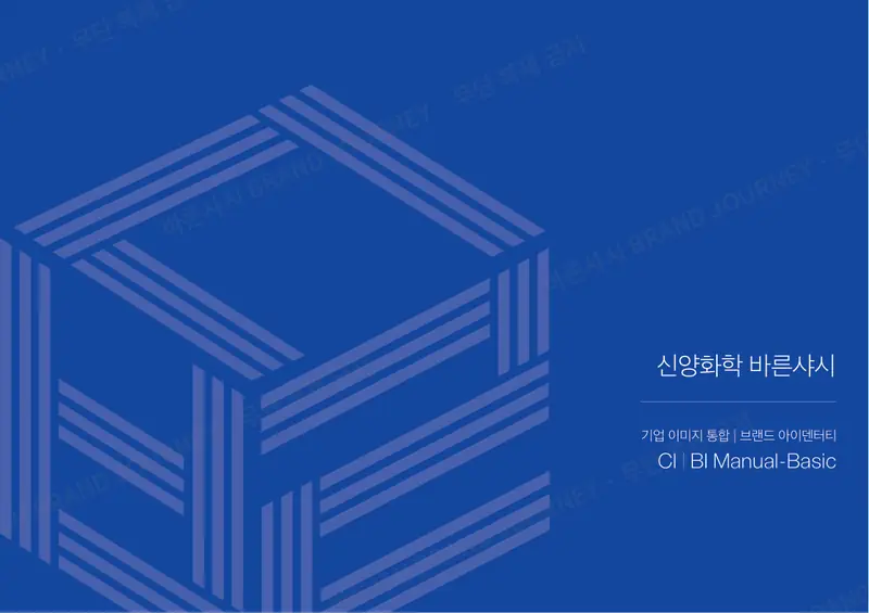
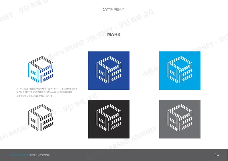
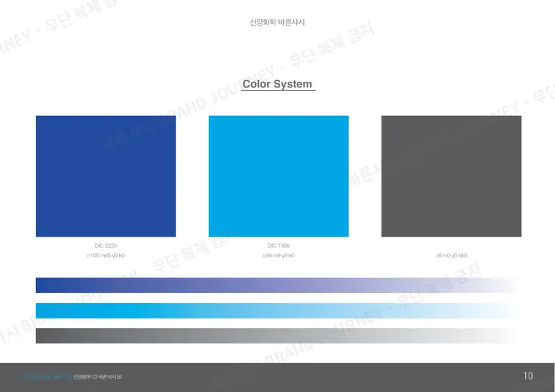
To reflect both the company’s history and what customers need, we started with the mark and the colors. This time, ㅂ·ㄹ·ㅅ became a cube inside a window frame.
- Mark
- A cube that combines ㅂ·ㄹ·ㅅ, using the shape of a window frame as its base. It expresses how much windows shape the beauty of a space.
- Color
- A blue rooted in cheong (靑), the blue among Korea’s five traditional colors (obangsaek)
TraditionEfficiencyCompetitivenessModernity
Planning & design: Chicago Comms Co., Ltd.
03Spring 2021Draft not adopted
The story we didn’t use
Storybook and corporate logo draft · Not adopted
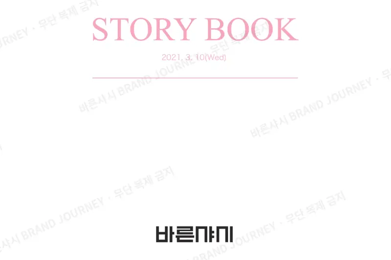
This round of work started with a story rather than a logo.
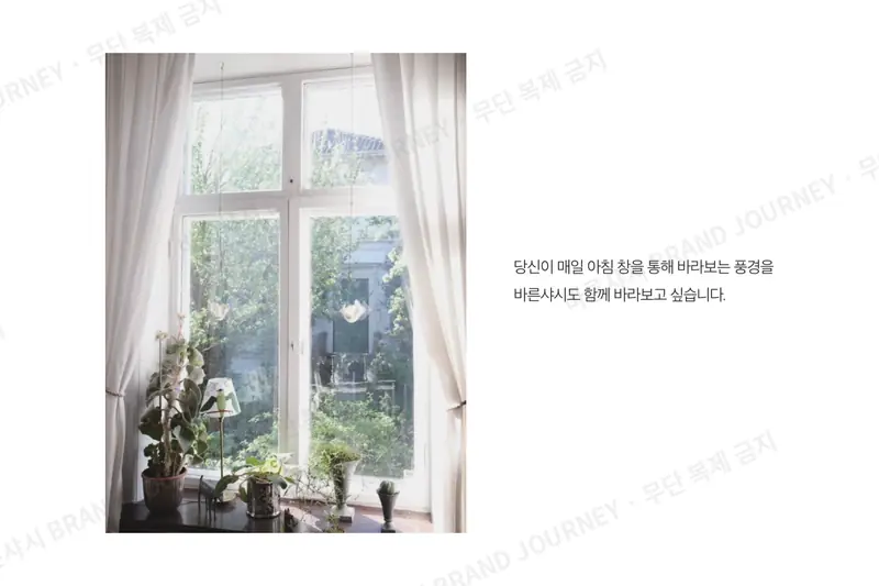
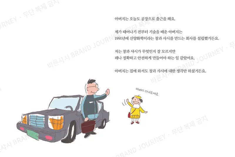
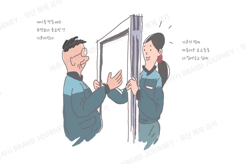
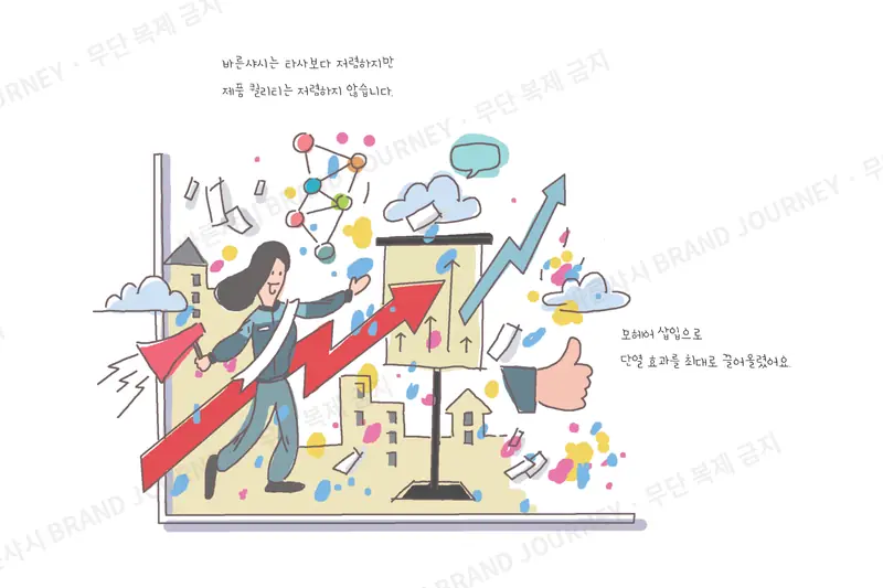
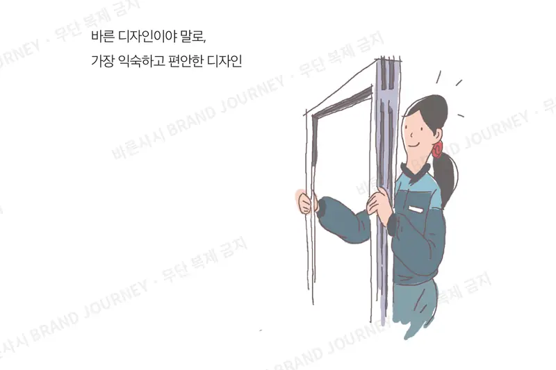
My father’s factory, sunlight streaming through the windows, the days I spent learning about windows: we turned these memories of the founder’s into a picture book.
The corporate logo draft we made alongside it was never used, but the words we found then became today’s message from the CEO.
The light passing through the window always came in straight and true,
shining as fully as it possibly could.— From the 2021 storybook
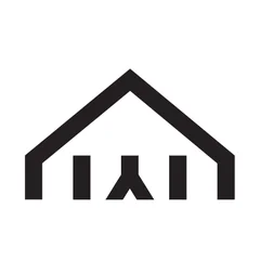
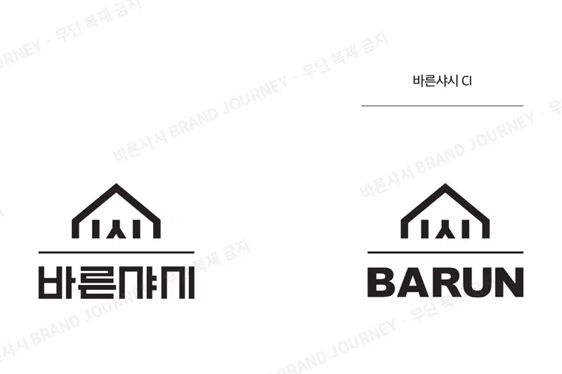
- Symbol
- A person (人) standing inside a house (ALL). The figure is also the ㅅ of 샤시 (“sash”).
- Key line
- “The right choice, BARUNSASH”
HomeWindowPeopleFamily
Planning: Sosomilmil Workroom · Illustration: Seobo Gu · Design: Soom Design


04Winter 2021 — TodayIn use today
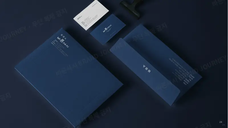
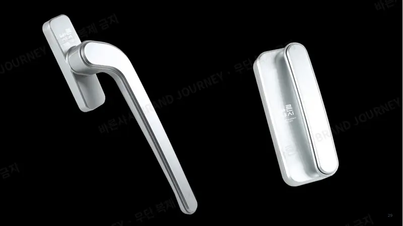
BARUNSASH today
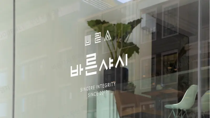
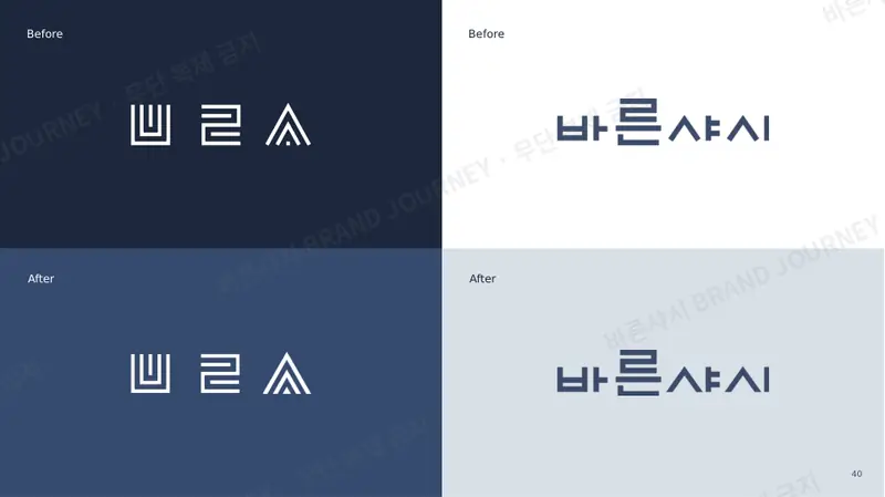
Final brand identity (December 23, 2021) · In use today
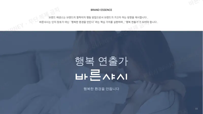
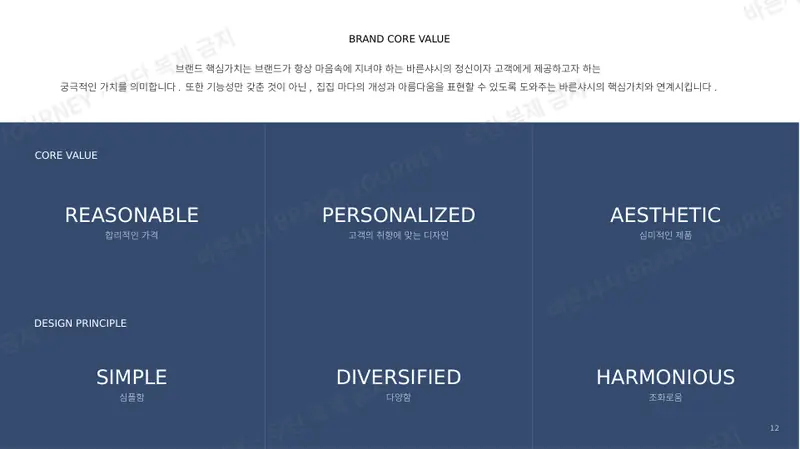
With the fourth round of work, BARUNSASH grew from “a brand under Shinyang Chemical” into a brand that stands on its own.
A brand that makes homes beautiful while keeping prices reasonable.
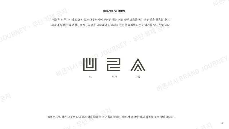
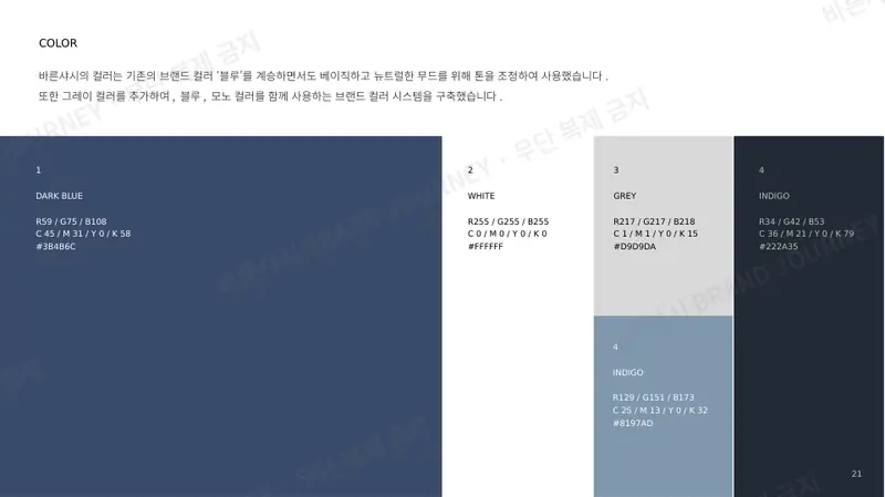
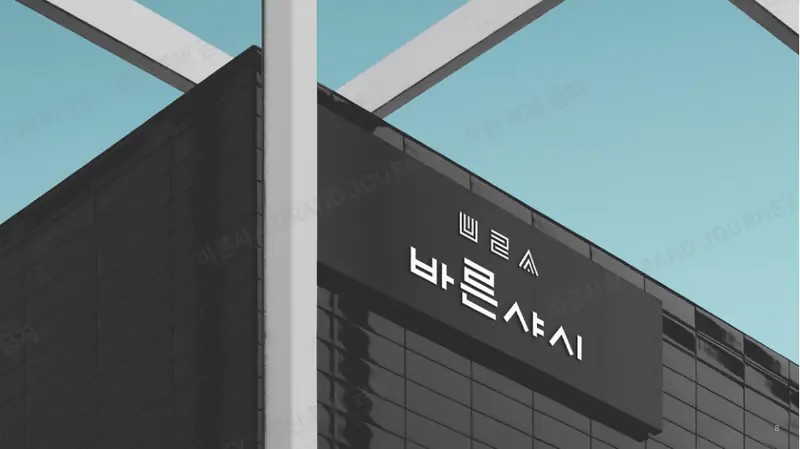
This is when our logo was born—each stroke drawn straight, in a style inspired by classic Korean woodblock lettering—along with the window, chair, and roof symbol. The colors of the website you’re looking at now were chosen then, too.
- Logo
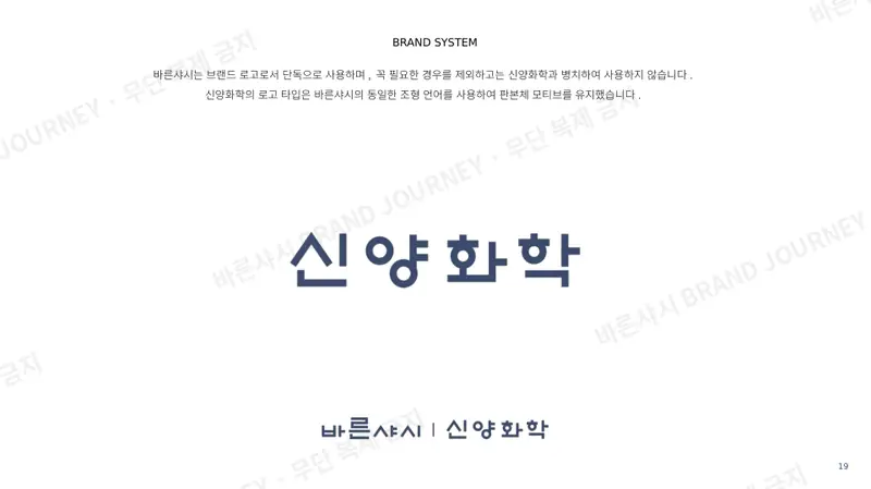
- Clean, straight woodblock-style lettering — “windows made right,” one straight stroke at a time
- Symbol
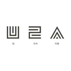
- Window · chair · roof — true rest at home
Branding & design: Waymaker
05Next chapter
A chapter not yet written
The shape of our name has changed four times,
but our commitment to doing things right never has.
Founder & CEO, Shinyang Chemical Co., Ltd. | BARUNSASH — Misun Sim
The images on this page are BARUNSASH brand assets. Unauthorized copying or distribution is prohibited.